
Celest Skateboards
A Sustainable Fusion of Nature and Urban Culture
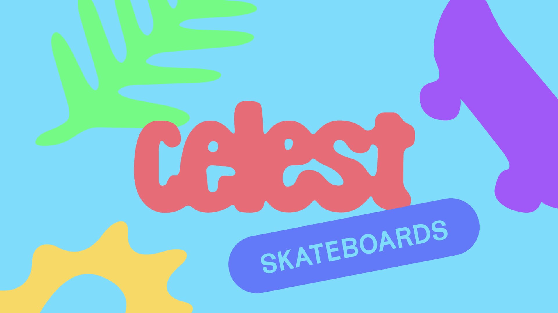
Celest Skateboards is the culmination of meticulous graphic design and branding work. With sustainability at its heart, and a touch of '90s urban culture, this skateboard brand captures the essence of what it means to be modern and environmentally conscious.
The Logo
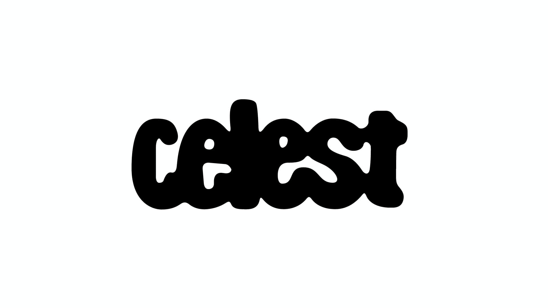
The logo of Celest Skateboards is the result of a blend of inspiration and typographic design work. The rounded shapes and subtle fusion of skate elements and sustainability reflect the essence of the brand. This logo is not just a design, it's a graphic representation of a vision.


A Custom Typeface
For this project, I created a custom typeface named Celest. Designed from a standard typeface exposed to the weather and rain, generating organic shapes that represent the brand's union with nature.
The Celest typeface is a testament to the power of nature and how we can leverage it for graphic design. The Celest font represents a seamless blend of human creativity and nature's timeless beauty, adding a touch of the natural world to our urban-centric brand.

Complementing the custom Celest typeface, we use Karrik as our secondary font. While Celest is employed to highlight specific elements, Karrik is used for running text, creating a seamless blend of these two unique typefaces.
This sans-serif typeface, rooted in vernacular typography, presents distinctive irregular shapes and a lack of optical corrections, which further complement Celest’s organic inspiration. The subtle chaos of Karrik’s design echoes the brand’s connection with nature, resulting in a truly unified typographic vision.

Visual Identity
Designing the visual identity for Celest Skateboards was an exciting journey, filled with vibrant and complementary colors that capture the essence of nature. These carefully chosen colors became the brand's palette, bringing a freshness that evokes the outdoors and the free spirit of skateboarding. I took inspiration from natural textures, transforming them with brand color gradients to add a distinctive touch.
Alongside the main Celest typeface, I created illustrations with round, organic shapes, a nod to the skate culture with their naive simplicity. The result? A visual identity that vibrates with the energy of the streets and respect for our planet.
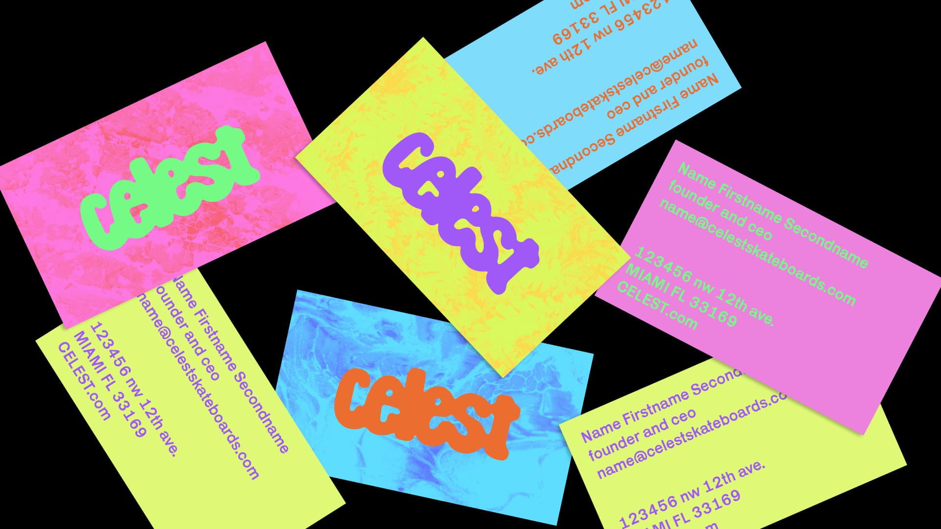
The visual identity of Celest Skateboards is versatile and playful, allowing the brand to apply and vary the provided colors or graphic elements as needed. This flexibility extends beyond its logo and typography, permeating every aspect of the brand. From merchandise to promotional materials, everything remains consistent and true to the brand's identity. With this branding strategy, a solid and easily recognizable identity is achieved.


Related articles or content:
These articles, resources and/or content will help you improve and learn more about creativity and other related topics.

Artificial Intelligence or AI for Graphic Design Applications

Automate your Editorial Graphic Designs with GREP